Devblog: Creating Galios
Hello, Tamers! Patch 1.5 launched late September, and with it, Temtem’s third Mythical Tem, Galios. Since it’s such an important Temtem, and the last to fulfill the Temtem roster, I sat down with Art Director Cris “Nae” Jiménez and Game Director Guillermo “YaW” Andrades to learn and share some insight on the birthing of the supernova Temtem! Grab a sippy drink and follow me.
Nae, what was the goal in mind with Galios’ design?
Since lore-wise Galios is in charge of rotating the Pansun’s plates and keeping the archipelago afloat, its design had to show power and omniscience. In addition, it was like the “final boss” of the game so it had to feel really special, almost like a god.
Was the shape something you already had in mind, or did it come later?
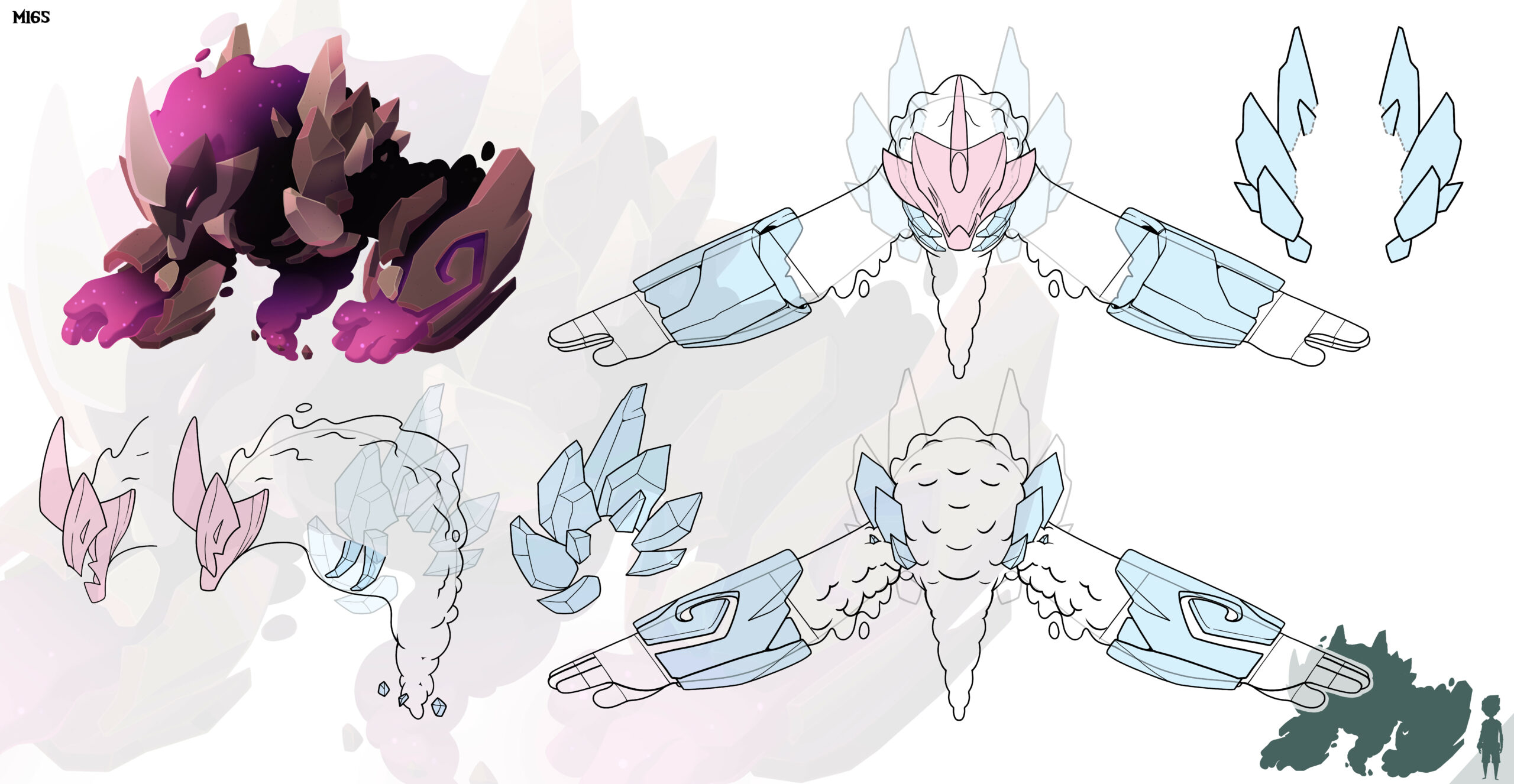
At first we explored the idea of making a creature with a more delicate and small appearance, but with large plates around to protect it, which would allow it to be tanky despite its size. This creature would base its menace mainly on its great mental power, but this design didn’t end up working like we wanted, so we ended up discarding it.
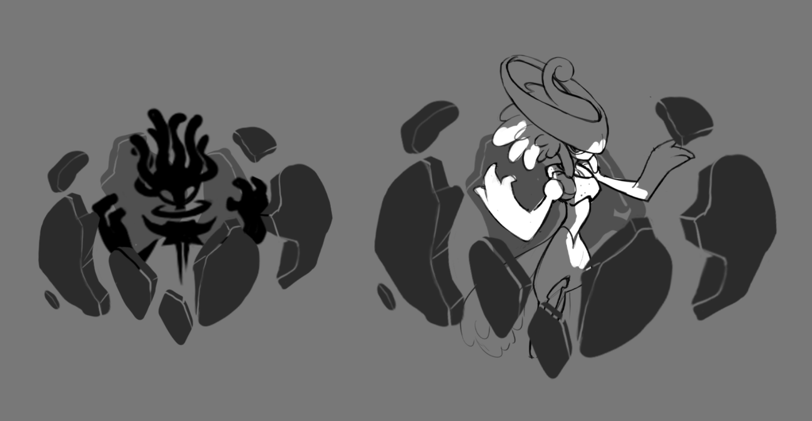
Then we went for a slightly-bulkier and traditional tank silhouette, but with an ethereal touch, almost incorporeal, an elemental of the cosmos. The first iterations felt too mental and less earthy, so we evolved that design until we found the perfect balance.
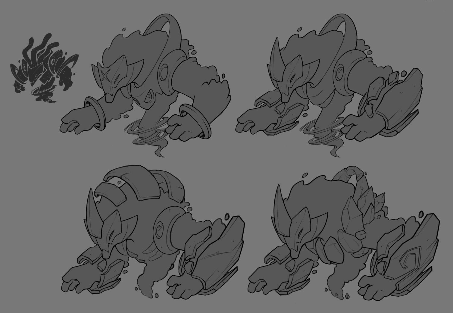
How did you include and apply the cosmic theme into its design?
As you can see in the previous image, the cosmic theme came quite straight from the exploration sketches for the silhouette. It seemed to fit quite well with the lore and with the mystic mood of the Tem. Besides, we had already explored this aesthetic a bit with Inkki and it had worked quite well, so with this one we wanted to go a step further.
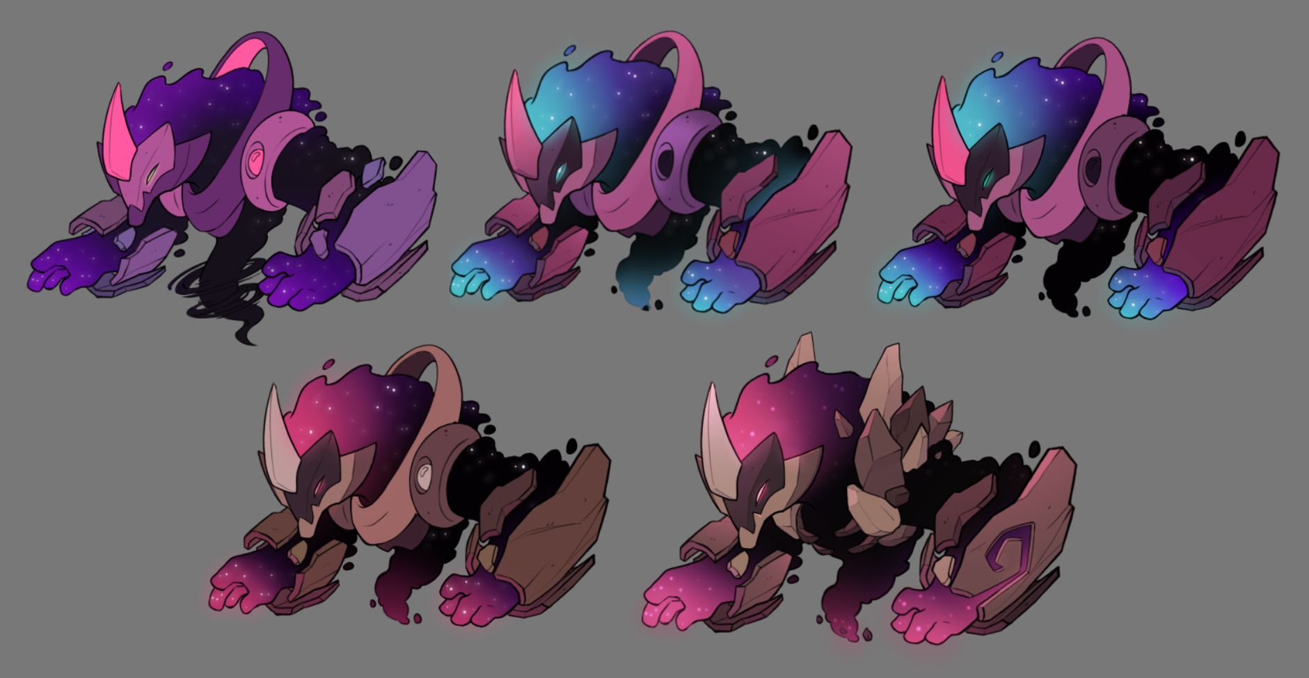
What do the color choices mean? Was it a straightforward process or did you explore other color patterns before reaching the current one?
Color palettes are never a straightforward thing haha! We started exploring a darker palette, closer to the Umbra’s color range, but the colors of the types were completely lost in that scheme, so we tried to explore a more traditional palette that represented them better. However, this gave us the idea that the boss itself could be in its Umbra version the first time you face it, and thus link it in a much better way with the later appearance of these.
We really loved the first tests with the blue and pink tones, but the mental type was much more predominant than the earth type, so we ended up using the original palette for the Luma and making a more balanced one for its regular look.
How was the designing process? Was there any blocker, any issue that arose during the designing?
As this was the last Tem planned we wanted it to be a very choral design where everyone in the team could pitch in. The whole 2D team was involved in its creation, giving feedback or new ideas, so you could say that it has a little bit of each one of us. We kept iterating on the design until both us and the design team were happy with the result.
During the design we had two main blockers. One, the initial idea of making the “tail” as if it were some kind of tornado. We were investigating how it could be done and if it was technically possible, concluding that it was going to make things quite difficult and possibly cause the in-game result to be worse.
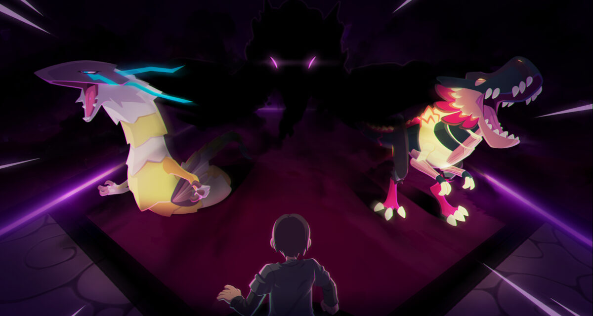
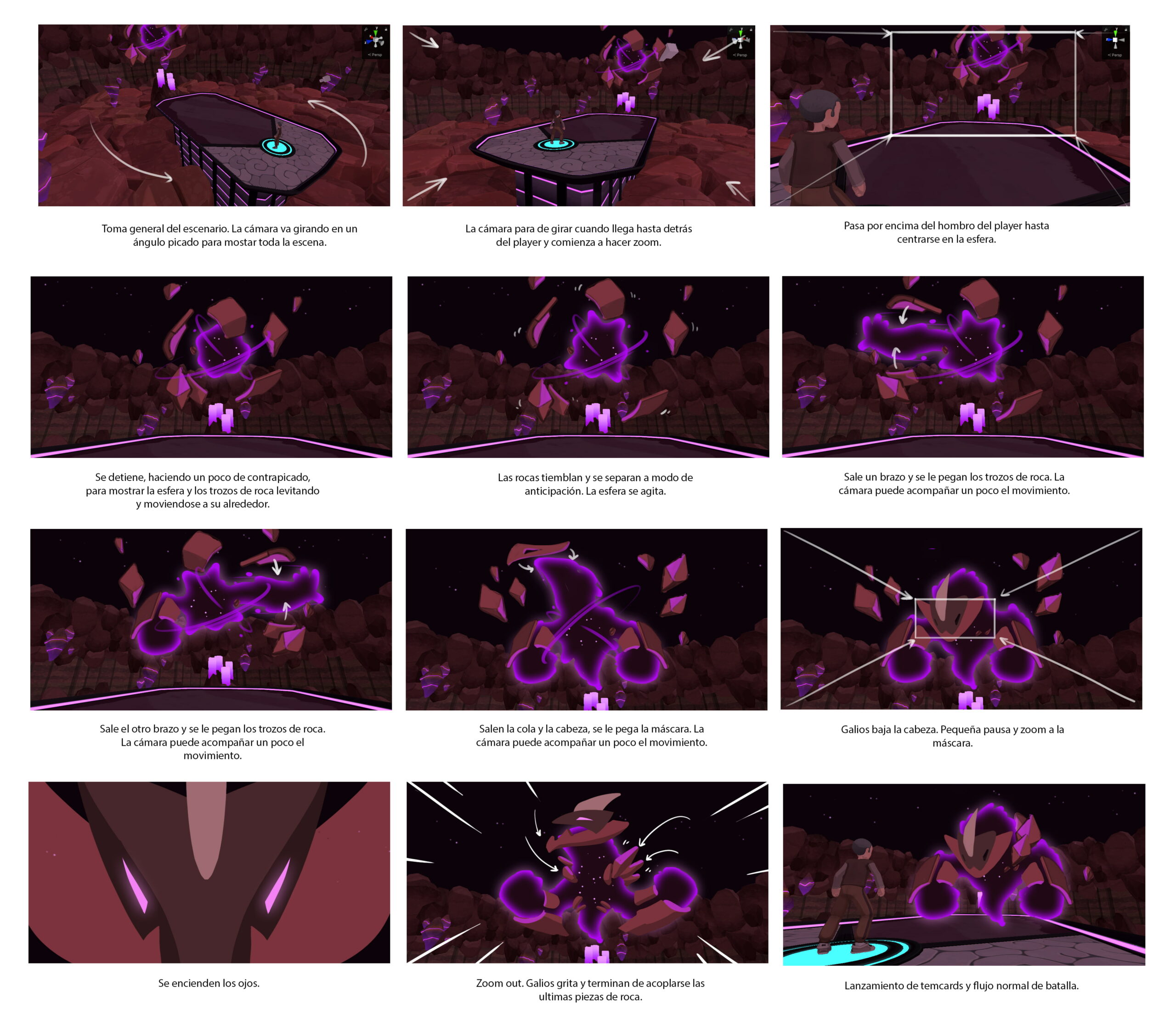
And two, the introductory cinematic of the Tem. We wanted to represent the idea that Galios is actually incorporeal, that he is formed only by pure cosmic energy holding the rocks around its body so…we went crazy with the storyboard.
YaW, what was the reasoning behind Galios’ type choices?
While most of the userbase thinks we simply designed Galios as a Mental/Earth because it was the only typing without representation in Temtem, that wasn’t really the reason, but more like a happy coincidence.
When we started thinking about Galios, we wanted for them to be fully incorporated into the lore of Temtem. The idea that Galios was living on the Pansun and was in charge of moving its tectonic plates was something that we had in mind very early on, so everything has been designed around that idea. We wanted to focus Galios on the tectonic plates and not the proper Pansun core, so having an Earth type relates a lot with the very earthly plates. Since we also wanted for them to be the one in charge of “moving” the plates, the Mental typing is a cherry on top, since it explains its ability to move something so heavy purely with its mind.
How was its kit designed? Was the idea of making a Doom-centered Temtem already in your backlog?
Designing and balancing Mythical Tems has always been something complicated. On one hand, we want them to feel like a special Temtem, something that is very unique and powerful, so the word “mythical” makes sense on them. On the other, we don’t want to create a Temtem so overpowered that it dominates the meta.
So for mythicals our vision has always been to create something unique that no other Temtem has. Something that can be defining for a match, but not something that reigns over the whole game constantly in every situation. For Galios, the art team embraced the “cosmic” approach very early on, so we wanted to go on that direction too. We started thinking about processes that stars or other cosmic entities could do and we reached the Supernova/Protostar duo that we liked a lot.
Doom is always a very conflicting mechanic, with mixed reception amongst the community, so we didn’t want to do something very oppressive with it. Instead, we wanted to think of a fun new way to use Doom. That way we ended up deciding that rather applying Doom to the enemies, Galios would be applying Doom to itself and working out the effects of the passives around it.
That will be all for today! Hope you’ve enjoyed this little insight into creating a Mythical Tem, and see you soon for our Halloween event and patch 1.5.1!
Have fun and Temtem up!
